I really enjoy the manual art for games that Atari themselves made for the 2600 VCS, 5200
Supersystem, and some of their other systems as well. During the boom years of the VCS,
1980-1983 or so, you can really tell that Atari was very proud of their accomplishment and
took great pains to make the artwork and detail on their boxes and carts very intricate
and attractive. After the crash, Atari's level of dedication and pride fell somewhat,
and coupled with the cutbacks and attempts to save money, they got cheap with their later
manual artwork. They often recycled older artwork for newer games, and released them in cheaper
printed forms (black and white). Many later manuals were quite abridged and shorter than their
earlier counterparts. Compare an earlier Ms. Pac Man manual which was 15 pages to a post-crash
manual of black and white demeanor and 3 pages. Blah.
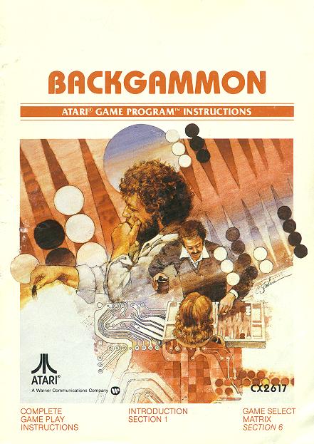
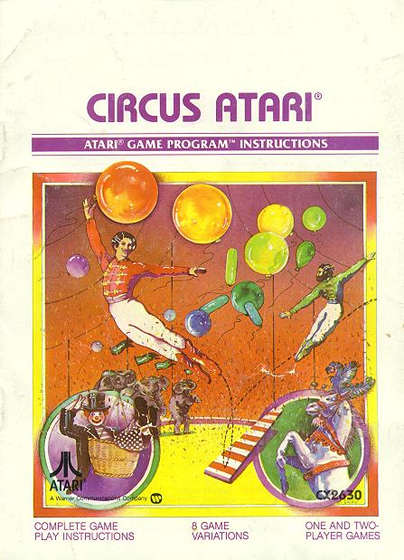
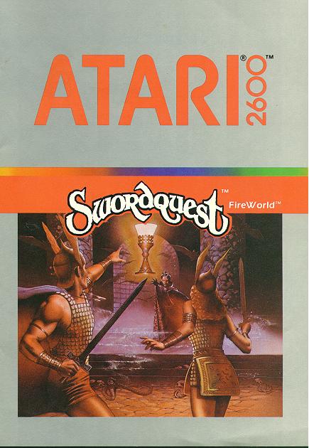
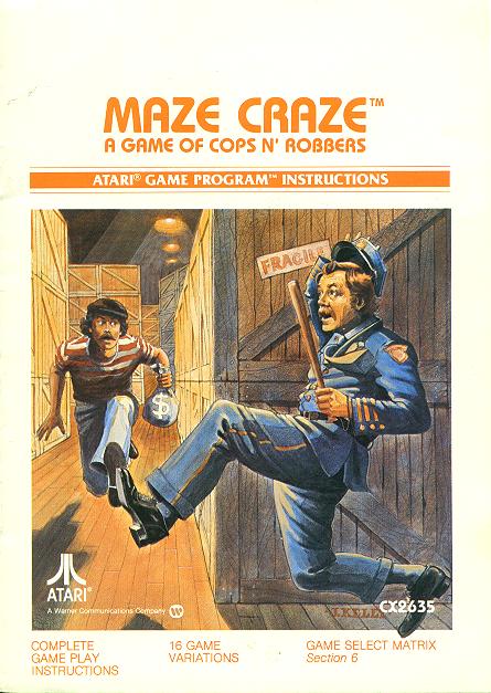
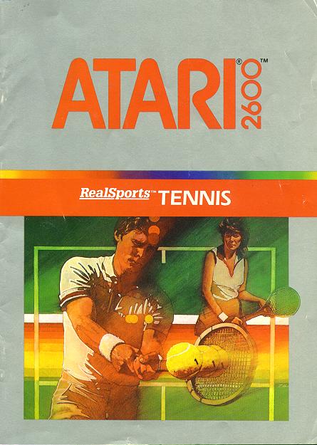
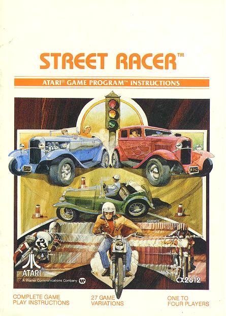
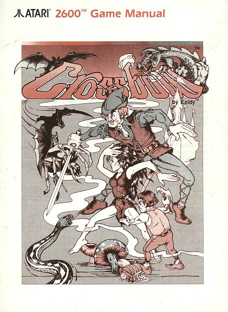
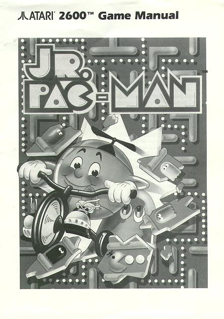
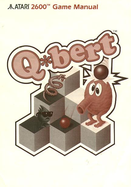
Take a close look at this one. You can tell that the artist went to some
pains to make a very decent product. This is one of my favorite pre-crash
Atari manual arts and I feel it best reflects the Atari frame of mind at that
time.
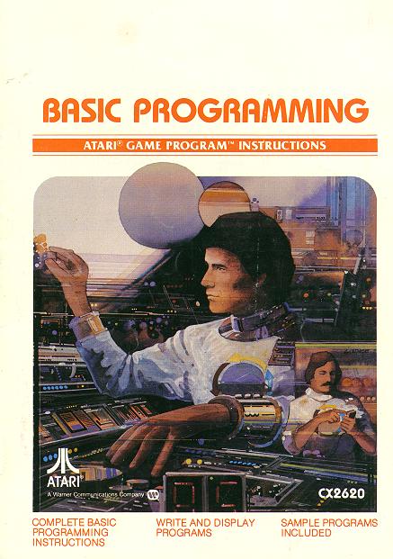
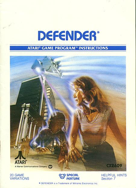
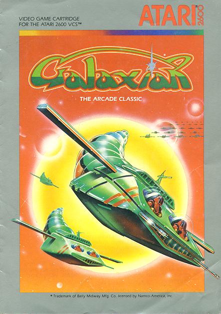
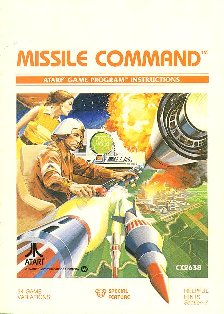
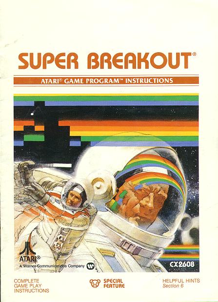
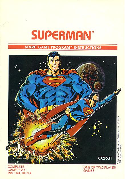
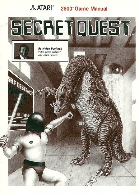
Another one of my favorites, this brings back to me the joy that came with playing
a VCS game, surrounded by a group of friends, and even that Christmas morning when I
got my own VCS. Even though Atari didn't make too many educational titles, they took
pride even in those few.
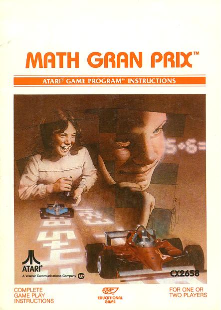
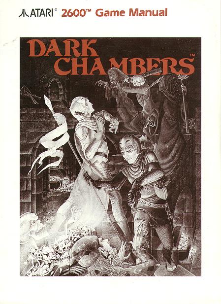
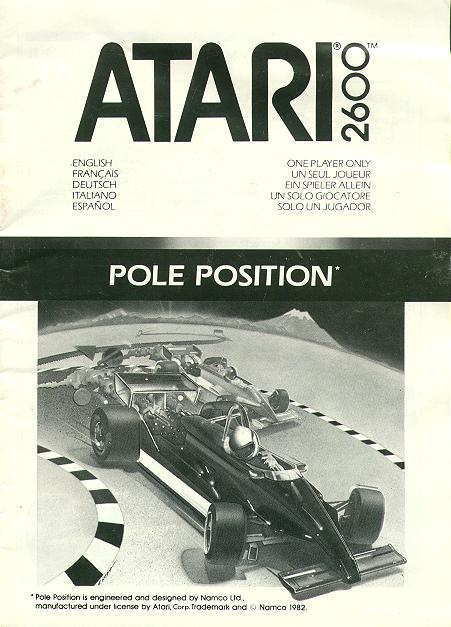
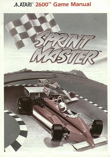
You might have noticed by now that the covers of these manuals are pretty drab,
black and white, and kind of non interesting. Well, this is the spirit of the post
crash manual art. It's no longer really painted, and it looks as if it was made by
an advertising company. This artwork is just fine, buy you can probably see
why I feel it lacks the luster of the original stuff.
